


Bauhaus-Archiv posters
Poster For Kandinsky's 60th Birthday
Herbert Bayer designed the poster for the Kandinsky exhibition in Dessau in 1926. The combination of text with photography and red bars, the slightly tilted arrangement: typical graphic elements of the 1920s are skillfully showcased here. The photo used was taken by portrait photographer Hugo Erfurth. In 1925, Bayer began photographing. At the same time, he started incorporating photographs into graphic design. Initially, the photos were treated like a geometric surface—as in this poster or the Bauhaus "Catalog of Samples." Later, Bayer perfected this into a combination of typography, symbols (such as dots or arrows), drawing, photography, and photomontage.
Poster Exhibition 1923 | Joost Schmidt
The poster for the Bauhaus exhibition in 1923 is a Bauhaus icon—and certainly the most famous Bauhaus graphic. The graphic designer Joost Schmidt adopted the stylized head from the Bauhaus emblem, which was designed by Oskar Schlemmer. He incorporated it into a composition of geometric shapes and correspondingly designed characters. The graphic appears to be playfully thrown together; the figure floats on the surface due to the leftward tilt. Overall, Joost Schmidt achieves a very harmonious overall form with his design. Comparable compositions were created by Oskar Schlemmer with his reliefs from these years.
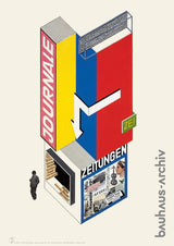
Herbert Bayer designed seven advertising structures in 1924. Among them are the designs for a newspaper kiosk and a cigarette kiosk, which are located in the Bauhaus-Archiv Berlin.
Photography by T. Lux Feininger. This iconic black-and-white photograph shows Bauhaus students engaging in lively play in front of the distinctive Dessau Bauhaus building. This snapshot was taken by T. Lux Feininger – son of the Bauhaus master painter Lyonel Feininger – who documented the school photographically since the mid-1920s and created one of the most famous scenes of the Bauhaus with his image "Sport at the Bauhaus."
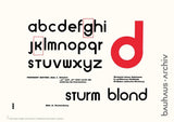
Poster Universal Alphabet - Herbert Bayer
"Attempt at a New Script" is the title of the text by Herbert Bayer from 1926 in the Bauhaus issue of the magazine Offset. The article is illustrated on page 399 with his design for a new "Alphabet." "Just as modern machines, architecture, and cinema are expressions of our modern times, so must script be," demands Bayer. Rigorous lowercase, simplicity, unity in construction, and composition in the primary forms of square and circle—these are his demands. These guidelines shape many Bauhaus designs around the year 1926. On the published sheet, two characters, the G and the K, are described as still unfinished. Bayer thus makes the design process visible.
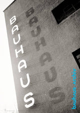
A photo from the Bauhaus-Archiv Berlin shows the view of the Bauhaus Dessau with the lettering designed by Herbert Bayer on the building. The lettering and the shadows of the letters mounted in front of the wall are set diagonally into the image. The original photo from the Bauhaus-Archiv collection was taken around 1930.
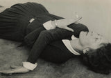
Poster Self-Portrait with Cigarette
Selbstportrait mit Zigarette, 1928 | Self Portrait with cigarette, 1928 by Gritt Kalin-Fischer.
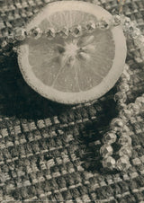
Still life with lemon and pearl necklace on woven rug
Still life with lemon and pearl necklace on woven rug, 1930 by Lony Neumann
Poster A1 | Color Plan Meisterhäuser
At the same time as the Bauhaus building in Dessau, residential buildings for the Bauhaus masters—the Masters' Houses—were built nearby in 1926. According to a design by Walter Gropius, three semi-detached houses—which are shown in the design—and a single house for the director were built. Alfred Arndt's color scheme was envisaged for the three semi-detached houses. The perspective is unusual: the houses are shown from below. The exterior walls are finished in pastel tones—pale yellow, pink and light gray. In contrast, overhangs, undersides of balconies, window reveals, downpipes and railings are rendered in bright red and blue. The color scheme shown on the poster was not executed. Walter Gropius had the exterior of the houses painted a clear white. The reason for this was probably that it made the clear cubic forms most apparent. Alfred Arndt's design is in the collection of the Bauhaus Archive Berlin.
Poster Skyscraper Friedrichstraße | Ludwig Mies Van Der Rohe
Ludwig Mies van der Rohe presented the ideal skyscraper in 1922: the floor plan like a trident star, the exterior completely made of glass, with three elevators at the core. The interior space seems unplanned. This skyscraper was not feasible at the time. In the design, an exaggerated photo, Mies van der Rohe emphasizes the contrast between the glass transparency and lightness of his skyscraper—and the oppressive heaviness of the old Berlin buildings, which were additionally darkened in the photo. The design depicted on the poster was created for the ideas competition for a skyscraper at Friedrichstraße station in Berlin. The location was to be the site between the station, the Spree, and Friedrichstraße.
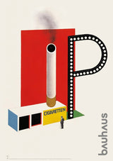
Poster Cigarette Kiosk | Herbert Bayer
The design for the cigarette kiosk emerged in an era when smoking — and even smoking chimneys — were still viewed positively. The kiosk features a large-scale color composition with an oversized, smoking cigarette placed in front of it. Beside it sits a striking illuminated advertising sign in the shape of the letter “P” — possibly a reference to a cigarette brand. In 1924 Herbert Bayer designed seven futuristic advertising structures that integrated novel advertising techniques such as film projection, illuminated lettering, sound, and even smoke-shaped letters. These avant-garde graphic concepts were visionary but scarcely feasible. In addition to the cigarette kiosk, the poster for the newsstand is also available.
Made in Germany
Dimensions: 59.4 x 84.1 cm